
Lipton Flavor Grid Stories: Nine Moods of Life
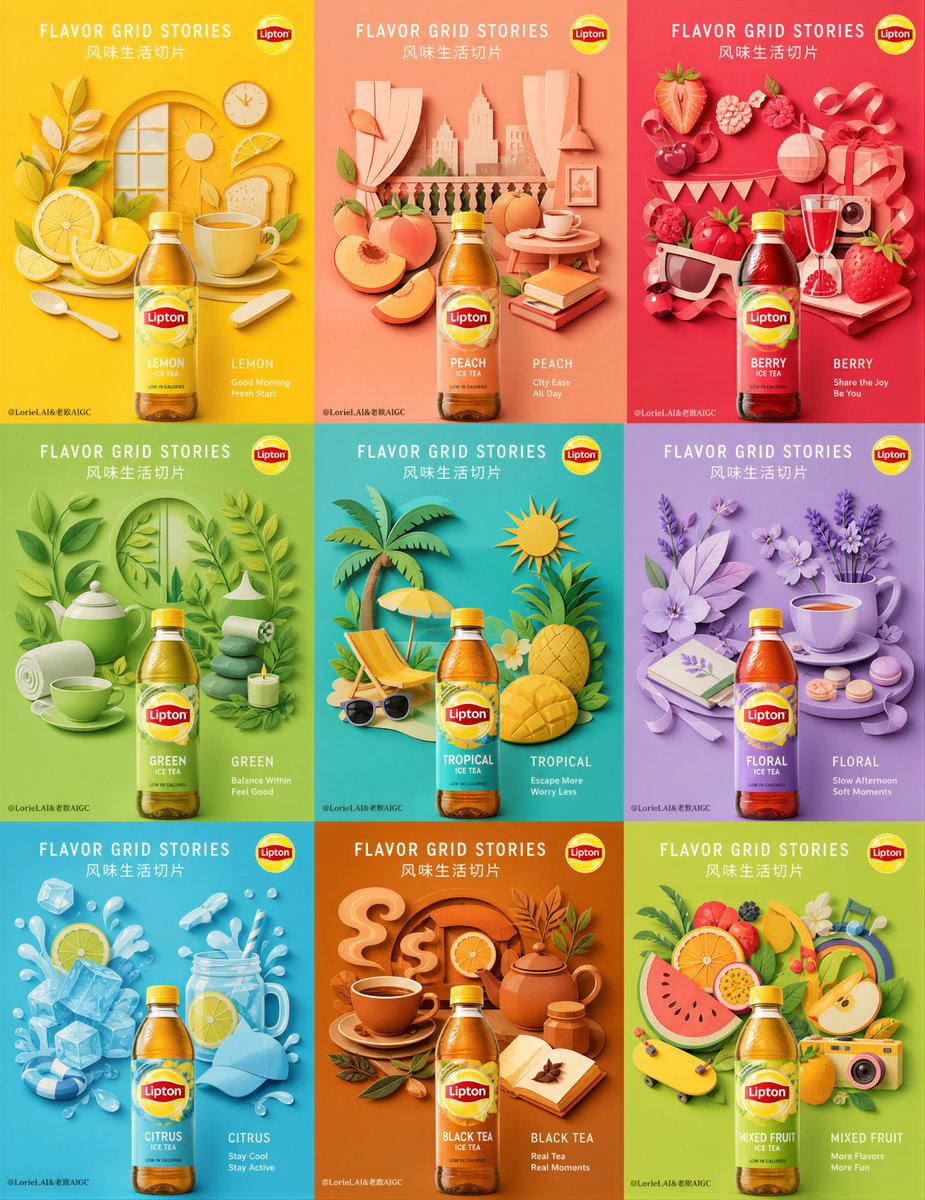
Divide the emotions of a day into nine small squares, each one reflecting a different rhythm of life. Fruity, refreshing, tropical, and soft-sweet notes are arranged into a vibrant mood chart. This is an ultra-premium 9-panel advertising campaign board using a strict 3x3 grid layout, with each panel featuring the same Lipton bottle but varying background colors and paper-cut lifestyle scenes according to flavor.
Prompt
Divide the emotions of a day into nine small squares, each one reflecting a different rhythm of life. Fruity, refreshing, tropical, and soft-sweet notes are arranged into a vibrant mood chart. GPT-image 2 prompt👇 Create an ultra-premium 9-panel advertising campaign board for Lipton, developed as the “Flavor Grid Stories” version. The full image must use a strict 3x3 grid layout and read as one complete, unified collectible campaign series rather than nine unrelated posters. Every panel must preserve the exact same product system: the same Lipton bottle format, the same front-facing hero angle, the same bottle scale, the same bottle placement, and the same lens logic. The only variables across the nine panels should be flavor identity, background color, and the flavor-linked paper-cut lifestyle scene. The final campaign must feel hyper-real, graphic, modern, playful, elegant, and globally premium. Core concept: Each Lipton flavor becomes a different lifestyle story capsule, but the product presentation remains perfectly standardized across the entire 9-panel system. In every panel, one real front-facing Lipton bottle sits in the exact same lower-center position at the exact same size, acting as the stable product anchor of the series. Above and around the bottle, flavor-specific cut-paper lifestyle scenes are constructed from fruit, leaves, utensils, cups, domestic details, leisure symbols, seasonal fragments, and daily-life objects. Each panel expresses a different flavor mood through different color coding and scene composition, but the bottle must remain visually consistent so the whole board looks like one official global Lipton bottle series. Series continuity rules: Lock these rules across all 9 panels: same bottle format in every panel, same front-facing hero angle, same bottle height and width proportion, same bottle placement in the frame, same camera distance, same shadow logic under the bottle, same clean studio perspective, same premium lighting family. The viewer must immediately feel that all 9 panels belong to one controlled campaign system. The only changes are flavor color, cut-paper lifestyle scene, and mood details. 3x3 structure: Use a strict 3x3 campaign board with nine equal square panels. Every panel must follow the same internal structure: upper and middle area for the flavor scene, lower-center for the real Lipton bottle, minimal elegant typography area, clean negative space, strong color-coded background. The bottle should sit at the exact same vertical and horizontal coordinate in every square. It must feel like a repeated commercial anchor while the worlds behind it shift flavor by flavor. Bottle product logic: Render every Lipton bottle as a real premium bottle product, not a box, not a pouch, not a carton. Every bottle must be front-facing, clearly readable, physically accurate, and identically scaled across the 9 panels. Show consistent bottle geometry, cap structure, label placement, bottle reflections, glass or plastic realism, liquid color difference by flavor, subtle condensation or freshness cues, and premium commercial finish. The bottle is always the hero anchor and must never be rotated, enlarged, reduced, or repositioned differently from one panel to another. Paper-cut lifestyle scene logic: In each panel, build a refined paper-cut collage world above and around the bottle using flavor-specific lifestyle objects. These scenes must feel like premium handcrafted cut-paper installations with subtle thickness, layered depth, matte surfaces, clean edges, soft shadows, and tactile realism. The scenes should not feel random. They must communicate a specific daily-life emotional world linked to the flavor: morning freshness, urban ease, social sweetness, wellness calm, tropical escape, afternoon softness, iced refreshment, tea ritual depth, playful fruit energy. Each scene must feel like a miniature story capsule suspended behind the bottle. Panel 1, lemon morning: Bright citrus-yellow background. Bottle remains fixed at lower center. Above it, create a clean yellow-toned paper-cut scene from lemon slices, breakfast cups, spoons, toast-like shapes, sunlight arcs, window details, and fresh morning objects. The mood is bright, energetic, and optimistic. Panel 2, peach city ease: Soft peach-coral background. Same bottle position and scale. Build a paper-cut city-lifestyle scene with peach slices, soft curtains, balcony shapes, café table hints, books, cups, and relaxed urban-living details. The mood is warm, stylish, and easy. Panel 3, berry social: Vivid red-pink background. Same bottle system. Build a lively berry paper world with strawberries, raspberries, cherries, ribbons, party-like accents, glassware, and playful social objects. The mood is juicy, extroverted, and cheerful. Panel 4, green wellness: Fresh leaf-green background. Same bottle system. Build a calm wellness scene from green leaves, tea cups, herb forms, spa-like details, breathing-space shapes, and clean restorative objects. The mood is light, balanced, and refreshing. Panel 5, tropical escape: Turquoise or aqua background. Same bottle system. Build a tropical holiday paper scene from mango slices, pineapple forms, palm leaves, beach-lounge shapes, sun symbols, and summer accessories. The mood is breezy, bright, and escapist. Panel 6, floral afternoon: Soft lavender or pale floral background. Same bottle system. Build a quiet floral paper world from petals, blossoms, teacups, trays, ribbons, and gentle afternoon ritual objects. The mood is elegant, soft, and poetic. Panel 7, iced refreshment: Cool cyan or icy blue background. Same bottle system. Build a chilled lifestyle scene with ice-cube geometry, citrus slices, straws, glasses, splash-like cut-paper forms, and outdoor refreshment objects. The mood is cool, active, and clean. Panel 8, black tea ritual: Deep amber or warm orange-brown background. Same bottle system. Build a richer paper-cut ritual world from teacups, steam motifs, darker fruit accents, breakfast objects, tea leaves, and grounded home-life elements. The mood is mature, layered, and comforting. Panel 9, mixed fruit joy: Bright lime, sunset orange, or vivid mixed-fruit background. Same bottle system. Build a playful colorful fruit-life scene from layered mixed fruits, curved shapes, leisure objects, and energetic daily-life fragments. The mood is lively, summery, and expressive. Composition consistency: Even though each panel has a different scene, the visual hierarchy must remain identical: bottle first, scene second, background third, text minimal and restrained. The bottle should never be visually buried by the collage. All scene elements must be arranged to support the product and frame it, not overpower it. Typography: Use an elegant English-led campaign typography system, minimal and premium. Main campaign title: “FLAVOR GRID STORIES” Chinese subtitle: “风味生活切片” Each panel can carry a small refined English flavor line if needed, but keep it restrained, airy, and globally branded. Add only subtle official-style logo placement and minimal supporting copy. Typography must never dominate the panel. Lighting: Use soft high-end commercial lighting across the full board. The bottle must receive consistent premium product lighting in every panel, while each paper-cut scene receives gentle directional light and soft shadow separation. The whole board should feel physically real, tactile, bright, and highly polished. Keep the lighting family consistent so the series reads as one shoot. Color direction: Use nine distinct but harmonized saturated background colors matched to flavor identity. The board should feel colorful and modern, but controlled and premium. Let each flavor panel have its own dominant hue while the full 3x3 board still feels coherent, collectible, and brand-consistent. Mood: playful, premium, graphic, collectible, modern, flavor-driven, tactile, organized, bright, hyper-real, elegant, internationally refined, lifestyle-rich Rendering style: ultra-premium Lipton 9-panel campaign board, strict 3x3 layout, all panels using the same front-facing bottle at identical size and identical position, flavor-specific paper-cut lifestyle scenes, saturated minimal backgrounds, refined layered paper realism, minimal premium typography, hyper-real bottle and packaging detail, world-class advertising key visual, 8k, global campaign quality Negative prompt: different bottle sizes, inconsistent bottle positions, different bottle angles, carton packaging, messy collage, weak product dominance, cheap cut-paper craft, cluttered layout, muddy palette, ugly typography, low-detail bottle realism, flat paper layers, low-end poster design
Kynvio Prompt Workflow
How to use this prompt
Open it in Image Studio
Send the prompt to Kynvio AI without starting a generation.
Adapt the details
Replace the subject, setting, colors, text, or composition for your goal.
Review and generate
Choose your final settings, then click Generate when you are ready.
Related GPT Image 2 prompts
GPT Image 2 prompts
About this prompt
Will opening this prompt spend credits?
No. The button only prefills Image Studio. Credits are used only after you start a generation.
Can I edit the prompt first?
Yes. The transferred text is fully editable before you generate an image.