
Nescafé Dessert Pairing Festival 9-Grid Promotional Poster
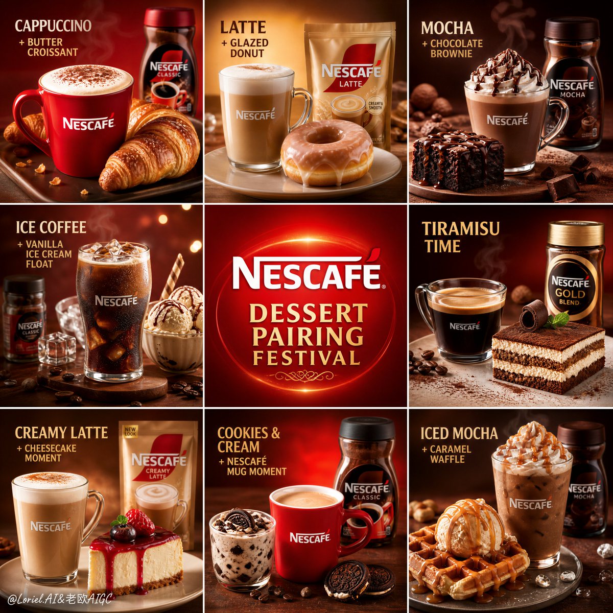
Create a premium 9-panel promotional poster for Nescafé Dessert Pairing Festival, featuring a central brand tile and eight coffee-dessert pairing tiles, in hyper-realistic commercial photography style with warm festive colors and elegant English typography.
Prompt
Create a premium 9-panel promotional poster for Nescafé, “Nescafé Dessert Pairing Festival” edition, designed as a highly organized square campaign grid with one central brand tile and eight surrounding coffee-and-dessert pairing tiles. The full composition must feel festive, appetizing, brand-forward, and visually unified, like a flagship retail and social-media campaign for a limited-time pairing festival. The center panel should act as the brand heart, while the surrounding eight panels each present one premium Nescafé coffee pairing with a different dessert. Overall layout: Use a perfectly balanced 3x3 square grid. The center tile is reserved for the Nescafé master brand identity, while the eight outer tiles each feature one real Nescafé coffee product combined with one dessert pairing. Every tile should feel like a mini premium advertisement, but all nine must belong to one cohesive visual system. Maintain consistent spacing, clean borders or panel separation, and strong visual rhythm across the entire composition. Center brand panel: In the center tile, place a clean, premium Nescafé logo lockup on a warm glowing red background. Add a short, elegant English festival title such as: “DESSERT PAIRING FESTIVAL” or “NESCAFÉ SWEET MOMENTS” Keep this center tile minimal and powerful, with subtle radiant glow, premium contrast, and no clutter. It must feel like the heart of the entire 9-grid. Outer pairing tiles: Each of the eight surrounding tiles should contain a distinct coffee-and-dessert combination built around a real Nescafé product. Use hyper-realistic coffee products such as hot mugs, cappuccino cups, latte glasses, iced coffee tumblers, mocha cups, or branded Nescafé jars paired with plated desserts. The pairings should feel premium, realistic, and visually delicious. Example pairing directions: - cappuccino + butter croissant - latte + glazed donut - mocha + chocolate brownie - iced coffee + vanilla ice cream float - espresso-style coffee + tiramisu - creamy latte + cheesecake slice - Nescafé mug + cookies and cream dessert - iced mocha + caramel waffle or cream puff Each tile should feel varied but equally polished, with one clear coffee anchor and one clear dessert partner. Food and product realism: All coffee and dessert items must be rendered with extreme realism and premium food-photography quality. Coffee should show rich liquid tone, foam, crema, steam, or condensation depending on the drink type. Desserts should look indulgent and refined: soft cake textures, glossy glaze, powdered sugar, cream swirls, chocolate shine, biscuit crunch, ice cream melt, or pastry flake detail. Every tile must feel craveable and clean, with no low-end buffet or generic cafe styling. Background and color system: Use a warm, festive Nescafé visual system across all nine tiles. The palette should be built from saturated Nescafé red, warm orange glow, espresso brown, soft cream, caramel beige, cocoa accents, and golden highlight blooms. Each tile may vary slightly depending on the dessert, but the overall campaign must stay unified and unmistakably Nescafé. Backgrounds should remain minimal and luminous, with soft glow behind the products and no unnecessary scenery. Typography and promotional tone: Use English as the main title language. Each outer tile can include a short premium English pairing label or mini promo title, such as: “TIRAMISU TIME” “LATTE + DONUT” “BROWNIE BREAK” “ICE CREAM AFFOGATO” “CHEESECAKE MOMENT” Typography must feel bold in hierarchy but premium and elegant, never noisy or discount-driven. Avoid supermarket flyer clutter. This should feel like a premium seasonal pairing campaign, not a cheap menu board. Lighting: Use polished commercial advertising lighting in every tile. Coffee surfaces should have realistic highlights and depth, hot drinks should show soft steam, iced drinks should show condensation and chill, desserts should have appetizing texture definition, and packaging or mugs should remain highly readable. Every panel should feel like a miniature luxury ad. Mood: festive, indulgent, appetizing, premium, warm, social-friendly, celebratory, brand-forward, elegant, memorable. Rendering style: hyper-realistic commercial coffee and dessert photography, premium FMCG promotional poster design, 9-grid campaign layout, glowing clean backgrounds, elegant English typography, polished advertising lighting, 8k, sharp but refined finish. Negative prompt: messy layout, weak brand center, noisy supermarket flyer style, cluttered discount text, low-detail coffee, flat lighting, distorted logo, random unrelated food, cheap dessert styling, inconsistent panel color, overstuffed composition
Kynvio Prompt Workflow
How to use this prompt
Open it in Image Studio
Send the prompt to Kynvio AI without starting a generation.
Adapt the details
Replace the subject, setting, colors, text, or composition for your goal.
Review and generate
Choose your final settings, then click Generate when you are ready.
Related GPT Image 2 prompts
GPT Image 2 prompts
About this prompt
Will opening this prompt spend credits?
No. The button only prefills Image Studio. Credits are used only after you start a generation.
Can I edit the prompt first?
Yes. The transferred text is fully editable before you generate an image.