
Lay's Brand Story Poster: The Birth of a Handwritten Logo
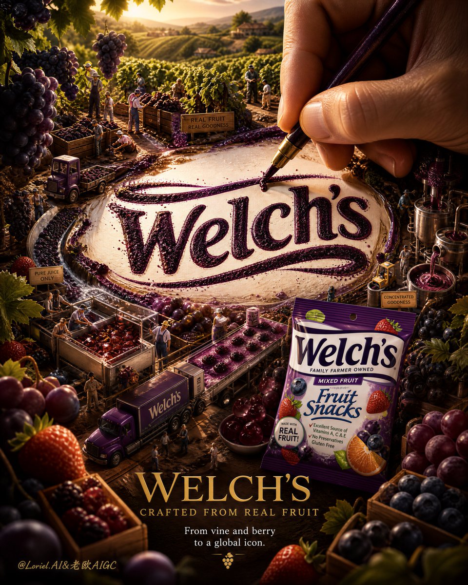
An ultra-premium vertical brand storytelling advertising poster for Lay's, centered on a realistic human hand actively writing the Lay's logo with a pen, making the logo the sacred core of the image, surrounded by a micro-narrative world from potato farming to snacking. Features warm cinematic lighting, hyper-real material detail, and elegant English typography, evoking an iconic, sacred, tactile, and cinematic brand campaign.
Prompt
Create an ultra-premium vertical brand storytelling advertising poster for Lay’s, built around one overwhelming central visual event: the Lay’s logo must appear as the absolute sacred core of the image, like a brand emblem being born in real time through human touch, ingredient matter, and micro-world narrative. A large realistic human hand holding a refined pen, brush, or stylus must actively write, trace, or finish the Lay’s logo at the exact center of the composition with visible pressure, believable contact, and elegant movement. The final image must feel like a world-class flagship brand campaign: hyper-real, tactile, cinematic, and emotionally iconic, with the logo functioning as the true altar of the whole visual universe. Core concept: This is not just a snack poster. It is the moment a global brand identity is being authored into existence. The Lay’s logo must feel like the heart of the story, the point where agriculture, craft, transformation, packaging, and pleasure all converge. The hand is not a decorative prop. It is the narrative engine. The writing gesture must feel intentional, ceremonial, and powerful, as if the brand is being inscribed by the force of its own history. Everything in the image must serve this central act of creation. Composition: Use a strong vertical poster composition with the Lay’s logo positioned prominently at dead center or slightly above center as the main visual anchor. The realistic hand must enter from the upper zone or upper-right area, large enough to feel commanding, with the pen tip or brush tip actively touching the logo surface. The logo should occupy the most powerful visual area in the frame and feel larger, cleaner, and more monumental than before. Around the logo, build a layered micro-world arranged in elegant concentric or tiered narrative bands: upper and rear layers for origin and farming, middle layers for transformation and seasoning, lower layers for packaging, transport, and final enjoyment. The eye must go first to the logo-writing act, then travel outward through the brand story. Central logo dominance: This is the main enhancement. The Lay’s logo must feel like the single most important object in the image: larger, more centered, more luminous, more materially integrated, and more revered. It should not read like a flat graphic pasted into the scene. It should feel engraved, drawn, dusted, or revealed through real food matter, starch, seasoning, crumbs, and golden particulate energy. The logo must feel almost like a brand seal or sacred commercial insignia, with the whole scene orbiting around it. Hand-writing interaction: The hand must show stronger action and realism than before. Show: clear pen-tip or brush-tip pressure, slight drag through powder, starch, seasoning dust, or textured surface, believable finger tension, refined knuckle structure, soft skin realism, tiny debris displaced by the writing motion, and a trace of active creation happening in the exact moment captured. The viewer should instantly understand that the logo is being written or finished by hand, and that this action matters emotionally. Micro narrative world: Build an exquisitely realistic miniature Lay’s brand universe around the logo, but keep it secondary to the central emblem. Lock the story layers clearly into: potato farming, harvesting, washing and sorting, thin slicing, frying, seasoning, packaging, transport, and final serving or snacking enjoyment. These story moments should appear as tiny but highly legible scenes distributed in clean narrative tiers around the central logo. They must feel coordinated and reverent, like chapters in a brand origin story. Product presence: Include the real Lay’s bag as a premium branded object within the composition, but keep it secondary to the logo-writing act. The bag can appear in the lower-middle or lower-right narrative destination area, front-facing and clearly readable. It should feel like the final branded culmination of the story, not the central star of the poster. The logo remains the true hero. Material realism: Render all elements with exceptional realism: potato skin, soil granules, starch dust, seasoning powder, crumb fragments, water droplets, oil sheen, paper labels, metal tools, mini transport props, and packaging reflections. The interaction between hand, logo, micro-scenes, and food matter must feel physically believable and premium. Lighting: Use extremely refined warm cinematic commercial lighting. The strongest hero light must strike the Lay’s logo and the hand-writing contact point. The hand should feel sculpted and alive. The micro-world should glow with carefully controlled highlights and soft directional shadows. Tiny glints should appear on dust, seasoning grains, metallic details, and packaging accents. The lighting must make the central logo feel almost consecrated. Atmospheric effects: Use subtle but premium atmosphere to reinforce the logo’s central power: fine starch dust, golden seasoning particles, tiny water droplets, soft warm vapor, micro crumbs, light trails guiding toward the logo, and delicate floating debris disturbed by the writing motion. These effects must remain elegant, controlled, and physically grounded. Background: Use a minimal but rich premium background, such as warm dark charcoal, textured earthy brown, or softly illuminated studio depth. The background must support the central emblem and writing ritual without competing with them. Keep the whole image controlled, deep, and ad-ready. Typography: Use an English-led premium brand-campaign typography system integrated elegantly into the composition. Main English title: “LAY’S” Secondary campaign line: “CRAFTED INTO EVERY CRUNCH” Supporting English copy direction: “From earth, to flavor, to a global icon.” or “Every crisp carries a story.” Typography should be sparse, elegant, and commercially strong. Use minimal official-style brand hierarchy and clean spacing. Never let text overpower the central logo-writing event. Color direction: Use a rich flagship palette: Lay’s red and yellow brand tones, earth brown, potato beige, golden chip amber, warm seasoning orange, soft water silver, and deep atmospheric charcoal. The palette must feel warm, appetizing, story-rich, and iconic. Mood: iconic, sacred, tactile, narrative, premium, warm, precise, cinematic, brand-led, collectible, globally recognizable Rendering style: ultra-premium Lay’s brand storytelling poster, giant centered Lay’s logo being actively hand-written, strong pen-tip pressure realism, miniature world of farming process packaging and serving orbiting around the logo, hyper-real material detail, warm cinematic lighting, elegant English typography, flagship commercial image quality, 8k Negative prompt: small weak logo, flat pasted logo, no visible writing action, weak hand interaction, cluttered micro scenes, cheap infographic look, cartoon miniature world, messy composition, unreadable branding, fake hand anatomy, low-detail materials, muddy shadows, low-resolution snack poster
Kynvio Prompt Workflow
How to use this prompt
Open it in Image Studio
Send the prompt to Kynvio AI without starting a generation.
Adapt the details
Replace the subject, setting, colors, text, or composition for your goal.
Review and generate
Choose your final settings, then click Generate when you are ready.
About this prompt
Will opening this prompt spend credits?
No. The button only prefills Image Studio. Credits are used only after you start a generation.
Can I edit the prompt first?
Yes. The transferred text is fully editable before you generate an image.